

As the 2018 World Cup approaches fans want everything. Analysis of their favourite players, tactical information with lineup projections and tips on who may or not perform well on the day.
With all of the sports media providing this information, we decided to put on our nerd hats and provide a different type of world cup analysis to appeal to the nerdy but design enthusiast. Below we count down the 2018 world cup flags from best to worst.
Enjoy, and please give us some feedback if you agree or disagree!
32. Poland
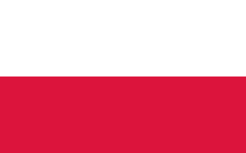
Sorry to the Polish fans out there but for us this is just so boring. No exciting emblems or aggressive looking animals and it’s too confusingly similar to the Monaco flag. Literally why?
31. England
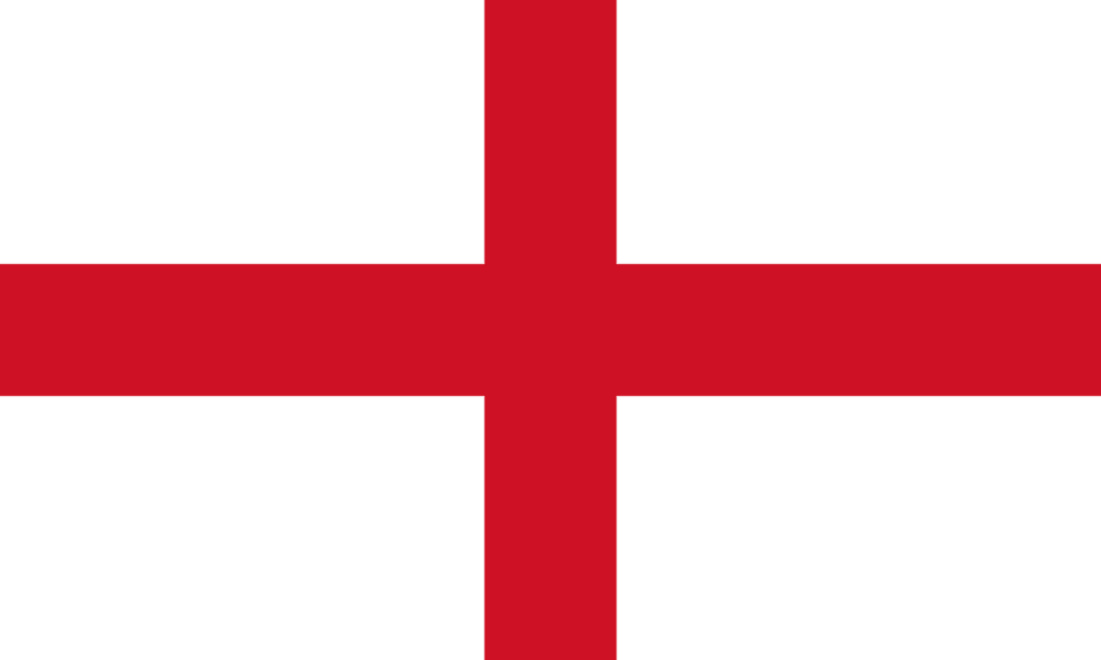
As an English business it’s a disgrace we’re ranking our own country 31st on this list. We’ll probably get not one lead from this blog as a result. Even though the St George’s Cross makes us think of the glory Euro 96 days and ‘football’s coming home’ the flag itself is dull and overshadowed by the more exciting and colourful Union Jack. Lets hope England’s fortunes are better in the football side of the tournament.
30. Russia
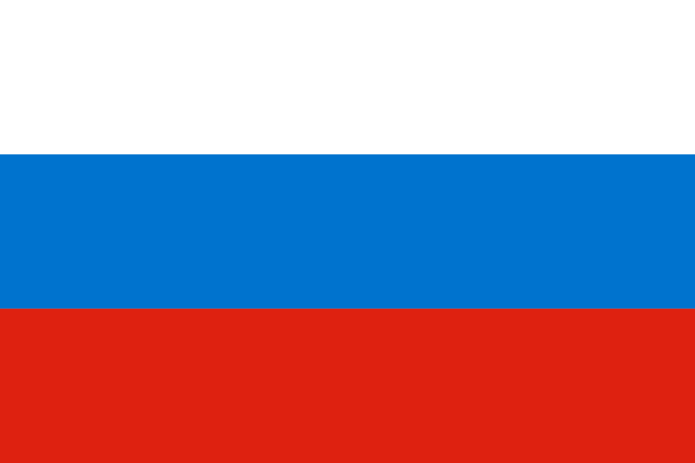
Slightly more interesting with three colours used but still very dull and rather uninspiring. Disappointing for a country known for its extraordinary palaces.
29. Japan
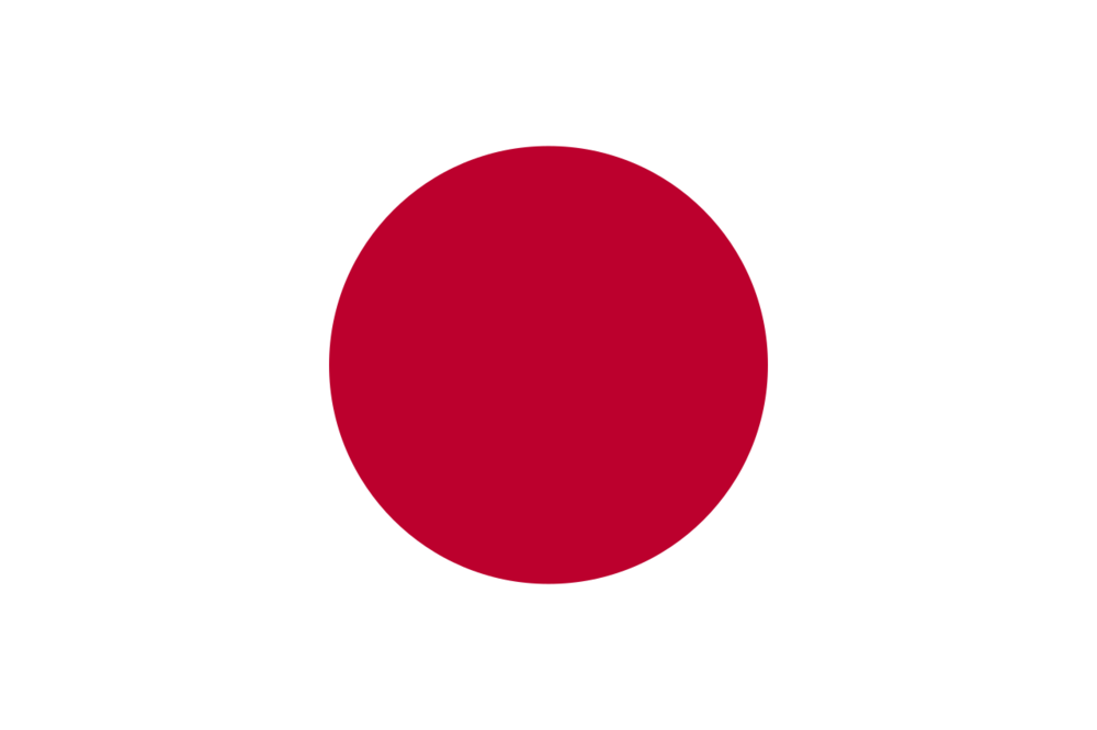
How does Japan beat Poland and England do you ask? The fact a circle is used is slightly more exciting than most flags. Typically most flags use rectangular and square shapes so the use of a circle has us mildly turned on as far as flag excitement goes.
28. France

Slightly better than the Russia flag but not by a lot. The bolder and larger use of red and blue gives this the slight edge over Japan’s lovely circle.
27. Nigeria

While people go crazy for the Nigeria world cup kit, their actual flag is underwhelming. Green is a fairly underused colour on flags, especially in this world cup so we give some credit here, but overall fairly disappointing from the Nigerian’s.
26. Australia
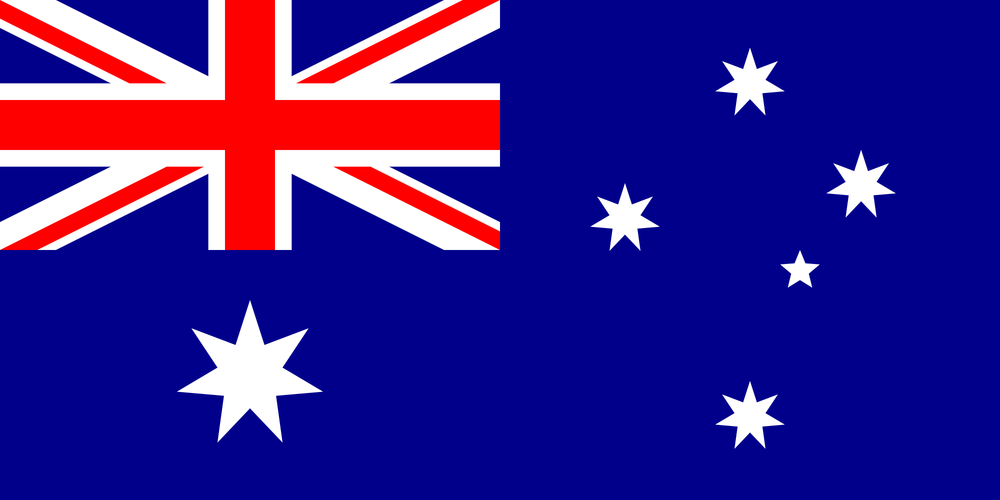
Finally, our first exciting flag with a bit more more going on. The issue we have with this is the random placement of the stars and the fact it’s plagiarising the union jack in the top left corner. The epitome of a good effort but poor delivery.
25. Denmark
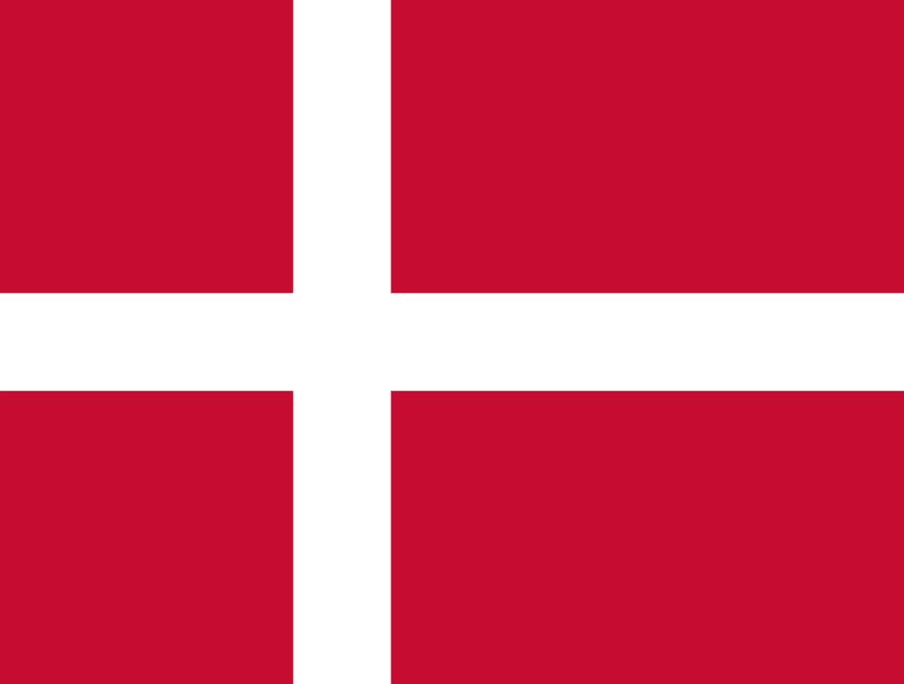
Credit to Denmark for the slight left alignment of the cross on their flag. The red and white work nicely but still nothing too inspiring.
24. Belgium

A strong but basic colour scheme. Black, yellow and red in thick blocks work well to combine for a solid but not spectacular flag.
23. Colombia

Similar to the Belgium flag a very solid mix of three colours. What pips the Belgian flag is the strong presence of yellow given precedent at the top of the flag.
22. Germany

Germany does a fantastic job of mixing black, yellow and red. Somehow they just do it better than Belgium with a more imposing list of pantone colours.
21. Tunisia
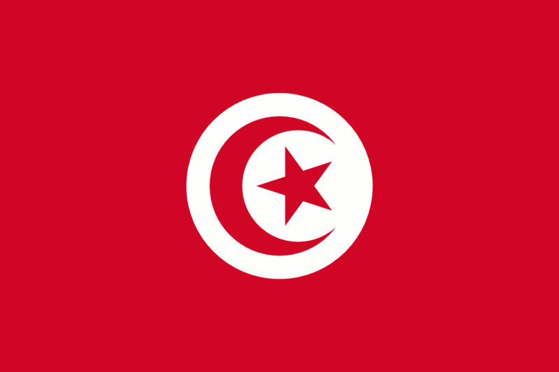
Starting to get sexier at this point. Strong red background combined with a nice moon and star in a white circle. Feel like they could have done a little bit more with it, but still a lot better than the previous ones.
20. Sweden
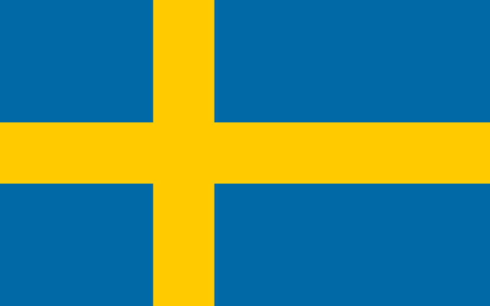
A country known for its beautiful people produces a strong flag. A winning combination of yellow and blue with the left aligned cross scores some good points with the Signify judges.
19. Morocco
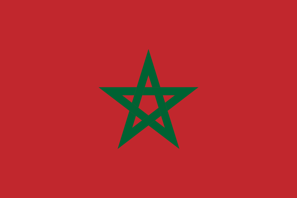
Simple, understated but strong. The Tunisia flag is similar to this but feels a bit cluttered and like too much is going on in a small space. Morocco follows a clean layout with a strong red and dark green star to beat out it’s north african rival.
18. Iceland
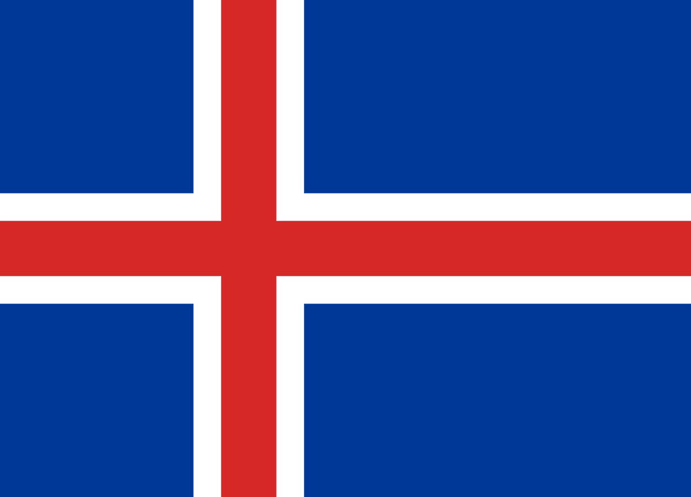
Iceland takes what Sweden and Denmark are doing with the left aligned cross and one ups them with the use of three colours. Perhaps not as sexy as the yellow and blue of Sweden but a more interesting mix of colours.
17. Iran
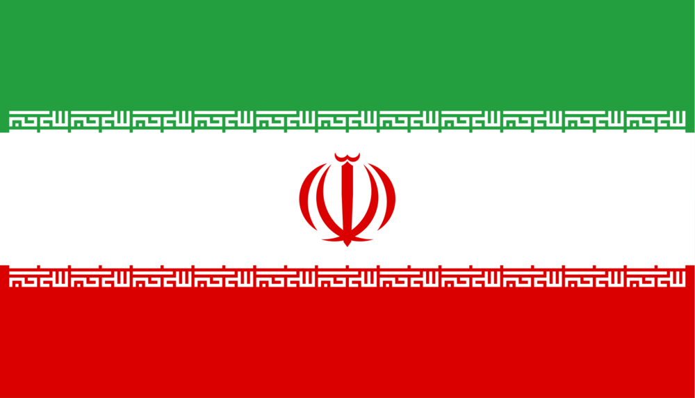
Ok we are now talking about the heavyweights. From here on there are some really exciting flags to look at. Iran is a pretty bizarre flag. A solid mix of three colours with the national emblem displayed in the middle. It also has takbir written in the Kufic script in white, repeated 11 times along the bottom of the green band and 11 times along the top of the red band. Trust me we had to Google this to find it out!
16. Peru
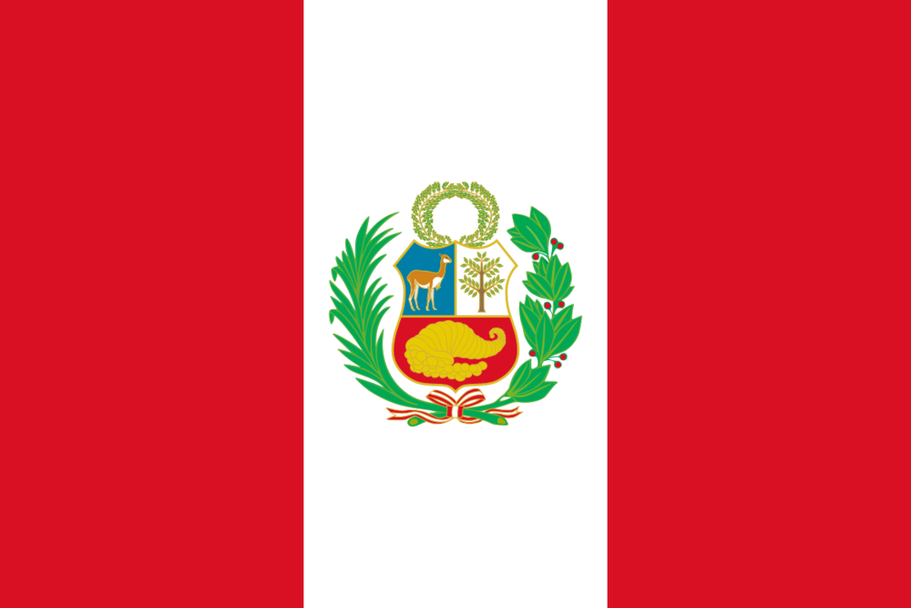
Peru has a fairly basic flag but a very exciting crest in the middle. The coat of arms features a llama (very cool) a tree and a centered cornucopia representing prosperity. Strong argument Peru could be ranked higher than this, let us know if you agree?
15. Portugal
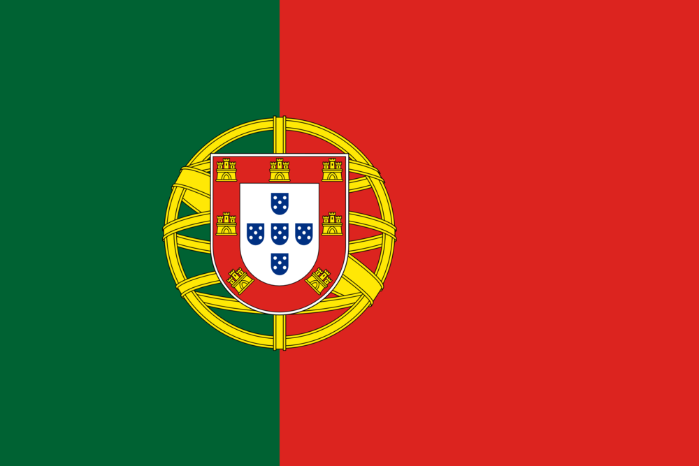
Portugal is an iconic flag with a strong mix of red and green combined with a coat of arms displaying the words ‘this is my beloved blissful homeland’. How beautiful.
14. Switzerland

Switzerland sneaks into a high spot with a fairly basic design but hosts two unusual features. First of it has an unusual plus sign right in the middle as well as the fact it’s a square design rather than rectangular. Clean but memorable. Think Apple.
13. Egypt
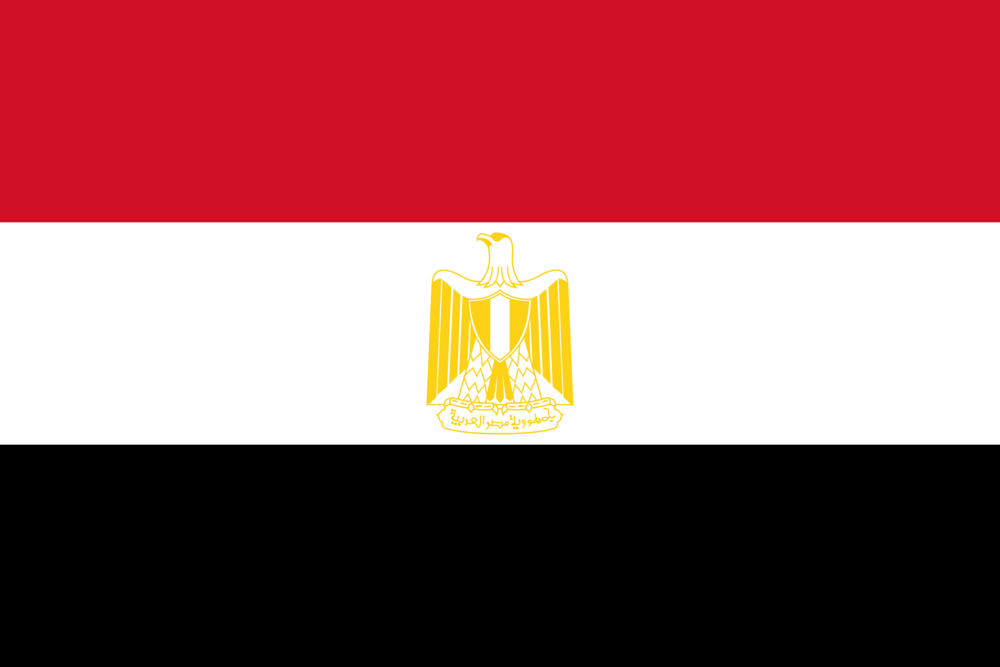
The colours of this flag are rather dull but the presence of an outrageous eagle known as the ‘Eagle of Saladin’ pushes this close to the top 10.
12. South Korea
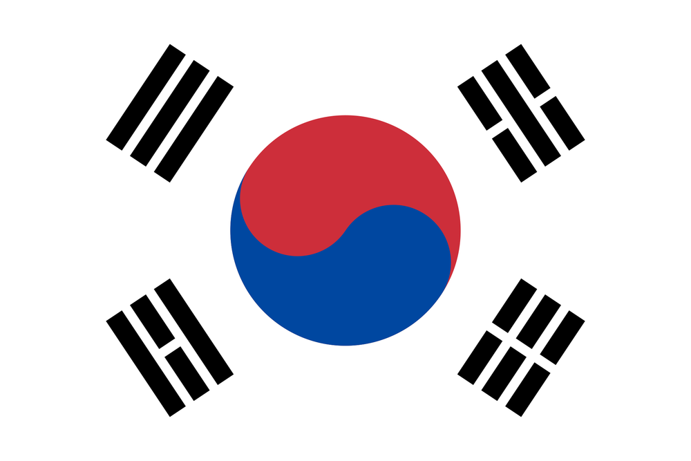
Gosh, it’s getting hard to choose between these now. South Korea’s flag is so unusual and different which is what we love, but is it actually that good? The flag is designed to mean balance and is called taegukgi which is also pretty cool. Solid work, if not a bit unusual South Korea.
11. Saudi Arabia
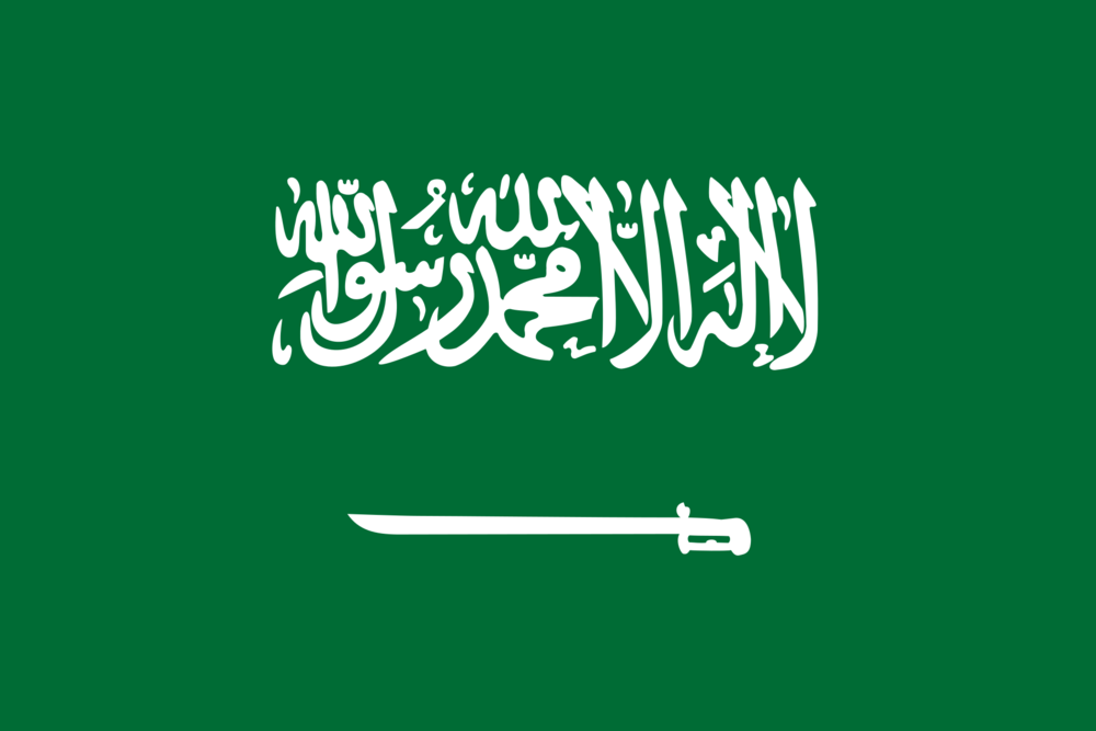
As soon as you include a sword (or saber as it is officially known) in a flag you are going to score points with the Signify judges. A great dark green combined with religious text secures its spot just outside the top 10.
10. Senegal
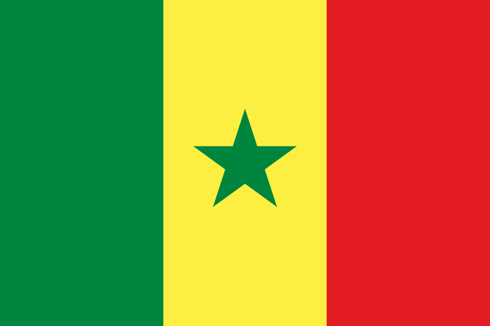
A cool and fun mix of colours with a star right in the middle. Strong and fun as a flag and a worthy first entrant to the Signify top 10.
9. Panama
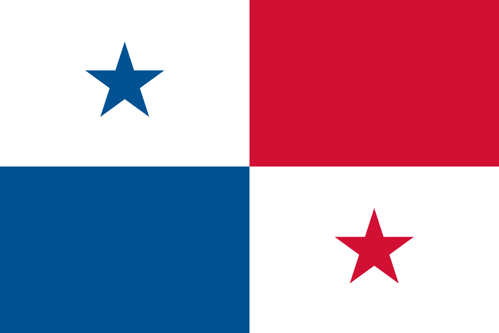
We absolutely love the Panama flag but it just feels a bit random. Great colours, creative and interesting but without any real purpose or meaning behind it. Feel like an interesting crest could have propelled this into the top 5. Alas.
8. Serbia
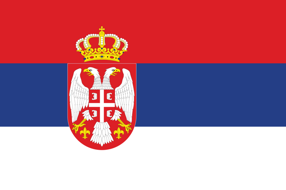
Solid mix of red, blue and white with a crest including a two headed eagle and a crown. A very commanding and strong flag all round.
7. Mexico
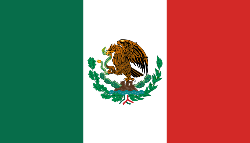
A snake fighting an eagle what a battle. This alone secures Mexico a top ten spot. The rest of the flag is nicely coloured with the Italian’s feeling slightly ripped off that their effort has been one upped.
6. Spain
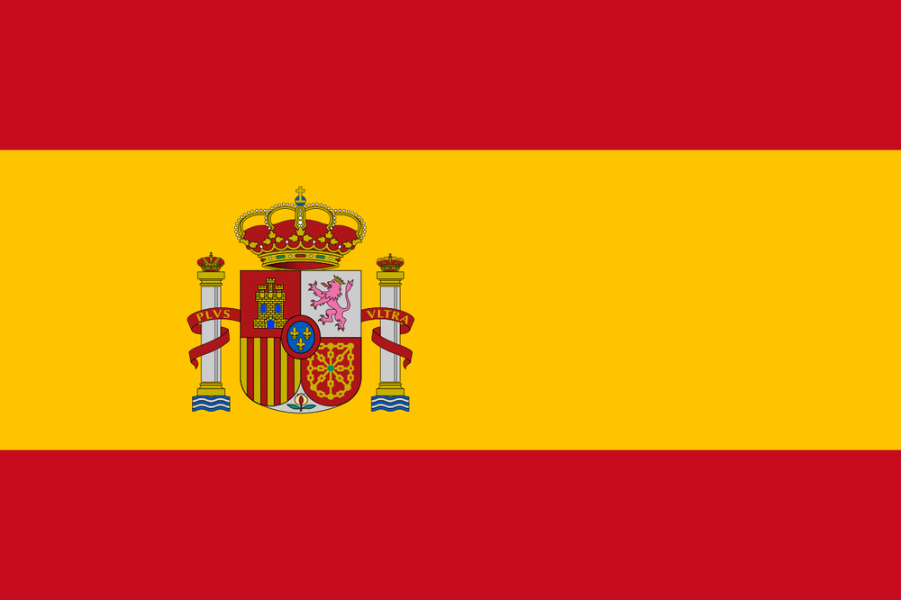
Fantastic mix of red and yellow with a beautiful coat of arms. The flag is known as ‘bandera de espana’ which makes it sound even sexier. Unlucky to miss out on the top 5.
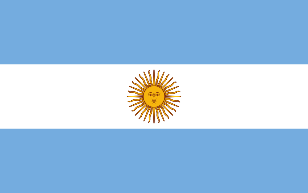
5. Argentina
Well deserving of the top 5. In the battle of tentacled sun’s Uruguay beats out its south american rival. Argentina oozes coolness with the blue and white and sun in the middle. It’s an iconic flag and deserves its spot at #5 on the Signify Digital rankings.
4. Brazil
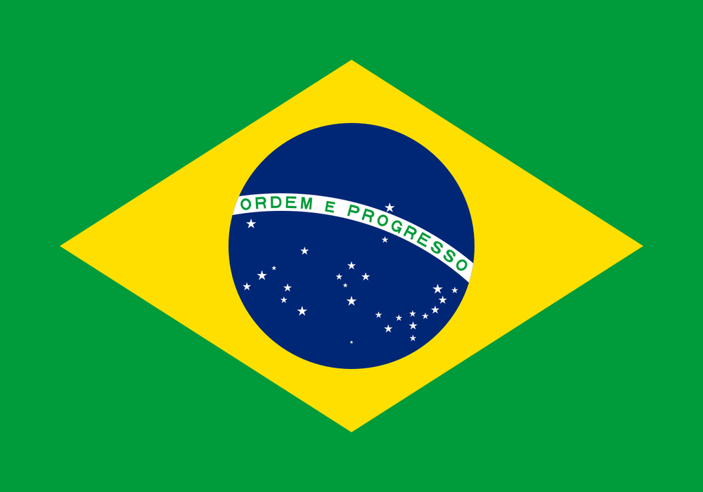
An extremely iconic flag that is unlucky to miss out on the top 3 due to harsh marks from the Signify judges. ‘Ordem e progresso’ on the famous planet means ‘order and progress’ which is inspiring and worthy motto.
3. Costa Rica
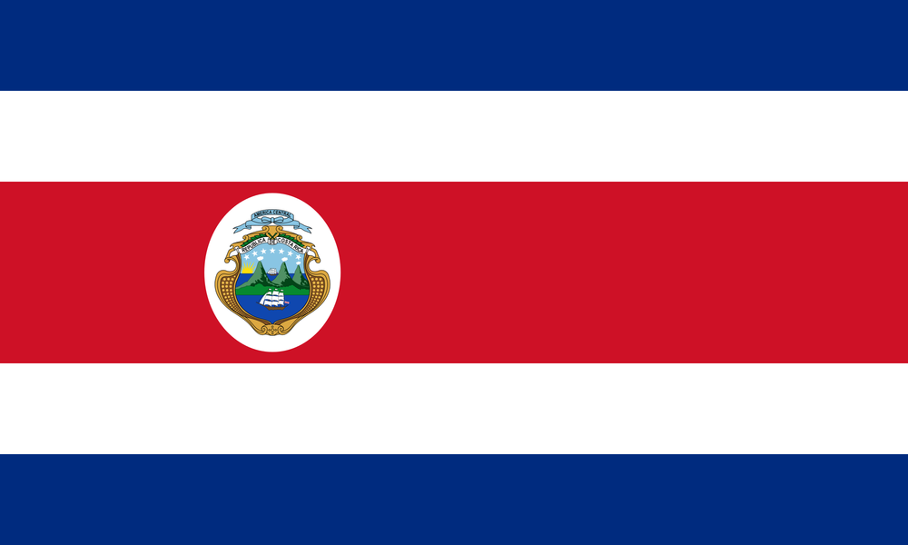
The Costa Rica flag has everything. A great colour mix, different size lines and a cool emblem with the coat of arms. It’s interesting, sleek, sexy and frankly the full package. Well done Costa Rica.
(We would like to bring up that a rival article from talksport incorrectly listed the Costa Rica flag without the coat of arms. How dare they)
2. Uruguay
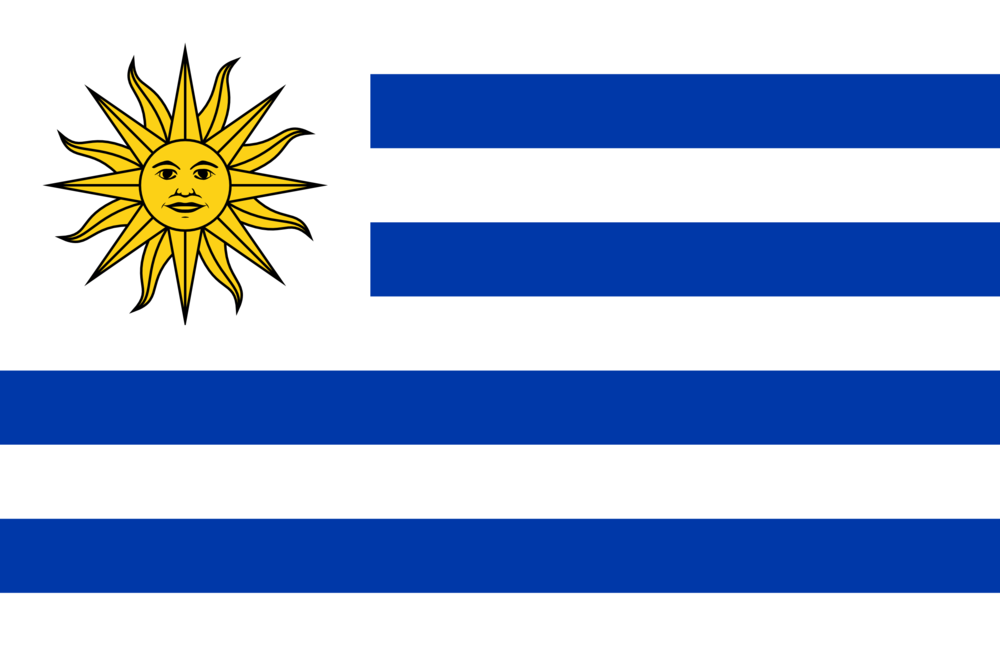
A tentacle sun in the top left hand corner combined with a sleek blue and white stripe combo. What an absolute beauty. Distinguishable and sleek from Uruguay getting them a well earned silver medal.
- Croatia
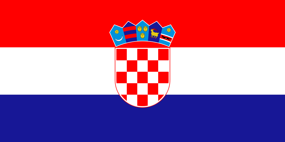
And the winner is Croatia! Signify has a soft spot for the beautiful balkan nation and its flag beats out all the other 31 with this absolute stunner. The beautiful mix of red, white and blue combined with the sublime red and white emblem of the croatian navy gives a sleek, cool and historic win. Also, how can you not love the golden goat with red horns?
Congratulations to Croatia.
If you managed to read all the way to the bottom of this blog then you know we write interesting and engaging content! If your business needs content writing or support to help you rank higher on search engines then just drop us an email and we’ll put together a completely free review of your website.
Hope you enjoyed the read and have a fantastic world cup!
N & B